Echo
Music Community App
Logo, UI elements, Figma Prototype, Mockups
Conceptual Project
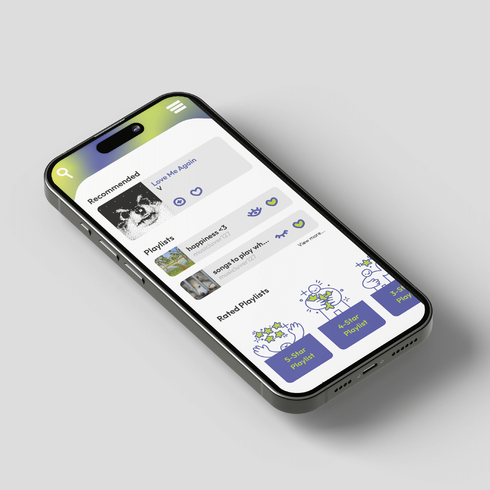
Echo is a music streaming and community app designed to bring people together through their shared love of music. Users can stream their favourite tracks, share their tastes and preferences, rate and review music, and explore the music choices of friends and peers. Echo creates an interactive platform for music discovery and connection, making it more than just a streaming service—it’s a community.
Brand for Community and Personalization
This project involved designing a brand identity and interface for Echo, a music streaming and community app tailored for an audience of music lovers, aged 18-40, who value creativity, exploration, and connection. Echo appeals to an open-minded, opinionated user base leading digital lifestyles with customizable accounts, interactive playlists, and music-sharing features. Drawing inspiration from leading platforms, I focused on a minimalist design with a limited colour palette, gradients, and engaging user features to enhance personalization and foster community.
A Unique Spin on Music Streaming
I began by researching similar apps and defining a problem statement to position Echo as a unique alternative in the music streaming space. Next, I established target personas to deepen my understanding of the audience, followed by ideation on Echo's look—a minimal, user-friendly design enhanced with personality through custom icons and illustrations. After logo sketching and mapping user flows, I created low and high-fidelity prototypes and finalized the colour palette, type, and imagery, adding additional screens for a fully realized user experience. With a clear vision from the start, revisions were minimal, focusing on minor adjustments like line weights and spacing to achieve a polished final design.
A Bold and Playful Design with Depth & Detail
I’m thrilled with Echo's final look. The gradients and hand-drawn elements added a unique touch that elevated the app's personality. This project taught me the power of hierarchy and nuanced colour tones within a limited palette. If revisited, I’d refine the layout of additional screens for better continuity. Echo showcases a fun, cohesive experience that meets my original design goals.